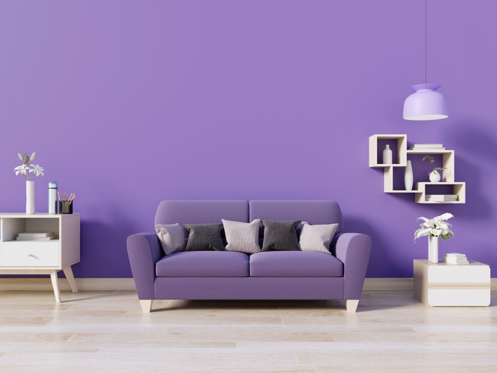
One of the toughest decisions you will ever encounter when designing your home is choosing a colour palette. There are so many shades to pick from. There is the consideration of which shades can mix and match. And then there is the risk of applying too much or too little in one space or corner.
Thankfully, there are rules you can follow to achieve an aesthetically pleasing palette.
The 60-30-10 Rule
This guideline basically dictates how you can evenly distribute the hues in the space. 60% of the room, which includes the walls, floors and some of the big furniture, should reflect the dominant colour. 30%, on the other hand, bears the secondary hue. It should offer a nice contrast from the dominant and must be seen in curtains, area rugs and the rest of the furnishings.
The remaining 10% is accent colour, reflected in throw pillows, potted plants and other ornaments. Usually, the accent is a bright hue. But you can also use deep, dark colours, like black for a more dramatic effect.
Once you pull off the 60-30-10 distribution, the space looks more put together, as it creates a sense of balance. Moreover, the entire design does not appear random because every design element is a deliberate choice to improve aesthetics. As you do your shopping and painting then, remember 60-30-10.
The Warm-Cool Rule
It is not a secret that colours affect the mood of a room. For the most part, this comes from the warm-cool colour choices. Warm hues, like red, orange, yellow, tend to prompt activity and energy into the space. Cool shades, on the other hand, such as blue and green, offer a sense of calm.
In general, you want to use the former in entertainment spaces, like living area and dining rooms, while the latter in rest and relaxation spaces, such as the bedroom and bathroom. However, this does not mean completely avoiding greens in living areas or yellows in bedrooms.
It’s still important to mix warm and cool colours but making the mood-appropriate hues stand out in respective spaces. So, for instance, you may have painted all your bedroom walls blue, yet place an orange statement sofa furniture in one corner. The design still looks perfectly well.
If you’re looking for a sofa sale here in Singapore, there are many stores and online shops you can visit that offer great discounts.
The Complementary Scheme

This is the simplest, most straightforward scheme professional designers use when choosing colour palettes. They refer to the colour wheel and see which hues sit directly opposite one another. Meaning, yellow and purple, red and green, or blue and orange works aesthetically.
Just a word of caution in using this strategy: these combos offer a high level of contrast. Applying it all over your space may be too overwhelming. That is why designers only use this scheme as accents, say when emphasising a certain corner or piece in the space.
They usually use a lot of neutrals as anchor or background for such palette. But if you can pick shades that are a little subdued, say, pastels, there should be no problem in reflecting it in the entire room.
Colour Rules for Better Aesthetics
Colour does a lot to the design of the space. It can dramatically increase its aesthetics if used right. But it can be just sheer visual disaster if applied wrong. If you do not want booboos you’ll regret for a long time, better stick to the rules.


