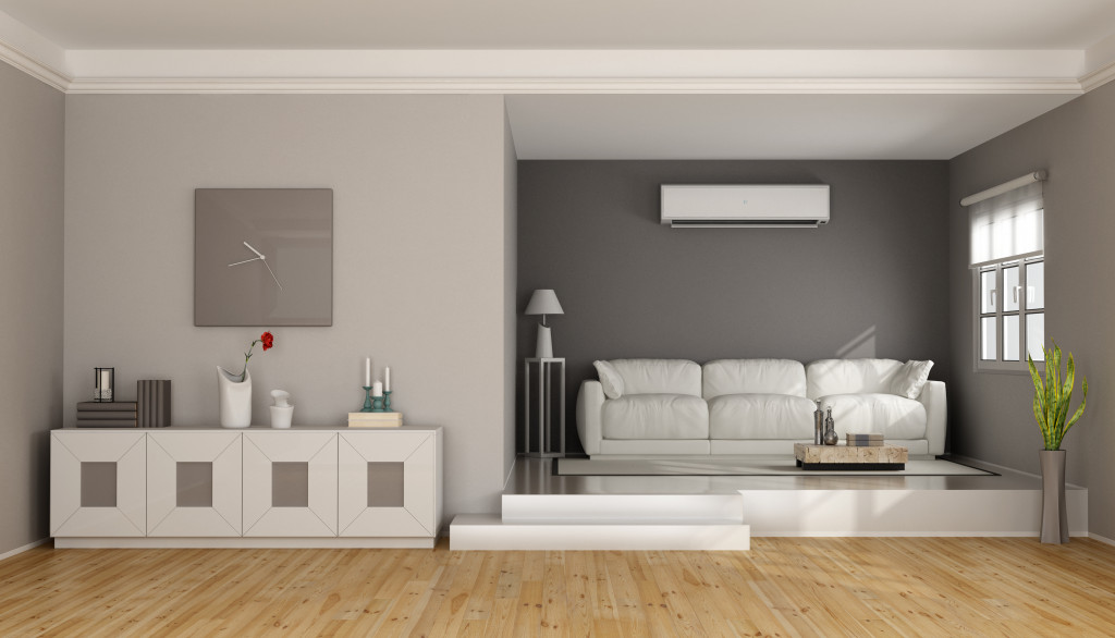
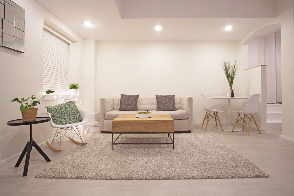
In a nutshell, minimalist design is all about doing the most with as few things as possible. In its most basic concept, Minimalism is about doing away with things you don’t need and sticking to what’s functional. Minimalist design can be summed up to mean a design aesthetic or style that focuses on form, functionality, cleanliness, and simplicity. The saying “less is more” can’t be more accurate than in minimalism.
Minimalist design is often associated with simple yet beautiful interiors, large open spaces, sparse decoration, and a calm and serene environment. It might be easier to stick to the most basic definition of minimalism, which is just sticking to the essentials. But minimalist interior design can, surprisingly, be a bit harder to achieve. If you’re still determined to get the minimalist living room of your dreams, here are some tips on how to incorporate it into your home.
Declutter your space
The first step to living a more minimalist lifestyle: get rid of things you can’t or don’t use. By now, you might be familiar with the Marie Kondo or KonMari approach, which dictates that you keep only the possessions that make you happy or which “spark joy.” This, of course, could mean many things depending on the person.
But essentially, to make a minimalist design work, you need to cut back on what you have displayed and keep only the ones you need. This means that any furniture or decoration that’s just taking up space, or doesn’t go well with the overall design and theme, has to go.
Consider what a piece of furniture or possession contributes to you functionally and the design of a room. Having more armchairs might be helpful if you have guests over, but does it complement the rest of the furniture? Does it just get in the way most of the time? How many armchairs do you need when you already have a couch that can seat many? Remember, when it comes to minimalist design, less is more, and the less unnecessary furniture and additions you have in your home, the better.
Take advantage of natural light
Often, the challenge of minimalist design is how to make a room look less cold, lonely, and uninviting with a limited color palette and as little furniture and decoration as possible. The answer: letting in some light. The proper use of natural lighting can do wonders to making a space look more welcoming and lived-in.
As such, large windows, sheer or transparent curtains, and glass sliding doors are a minimalist must-have. If you’re worried about privacy, you can have blinds on your windows or glass doors and have them open during the day.
Natural light not only brightens up a room, but it works well with the wide-open spaces and primarily neutral color palette of minimalist design. Plus, it’s just better and healthier to bathe in as much natural sunlight as you can.

Stick to neutral and subdued colors
A neutral color palette works best with a minimalist design. Most minimalist interiors use white, gray, beige, and other more subdued colors to light up the interior and make it seem bigger than it is. A restrained color palette is the go-to for a lot of minimalist designers. Other than monochromes and neutrals, you can try pastel colors as well. Colors that aren’t too bright, saturated, or loud work best in a minimalist interior. Plus, neutral and monochrome colors go with a lot of other colors and decorations.
Use bright colors and patterns as accents
Don’t fret if you want to be minimalist but still want to incorporate some bright colors. You can still have a splash of color in your living room without sacrificing minimalism. Limit the bright colors to a few accent pieces, such as paintings, throw pillows, rugs, or an accent wall. Going minimalist doesn’t mean giving up color entirely.
A bit of bright color works amazingly in a minimalist space. For example, you can add a bit of red in your living room — red throw pillows, a red ottoman, a few ornamental pieces, and predominantly red paintings. Don’t let it overwhelm the rest of your design, and make sure it “accents” the neutral colors instead of completely overshadowing them. Remember, less is more.
Alternatively, you can play with different patterns and textures for your decorations. The correct pattern or texture could make a great accent to a room. The same rule applies — make sure that it’s not too much or overwhelms the rest of your decoration.
Open up the space
When you’ve cleared out all unnecessary stuff and are left with only the bare minimum, you might be wondering, what am I going to do with all that space? The minimalist answer? Just leave it. With minimalism, you don’t have to worry about filling every possible space in the room with something. If you arrange your furniture and add a few accent pieces, an open area can add more breathing space and highlight the rest of your furniture. It’s all about finding a good balance between the empty and the filled spaces.
Always remember: less is more
This saying has been quoted when it comes to minimalism, but that’s because it still holds true. Less truly is more in minimalism, no matter how contradictory that sounds. When in doubt, it’s best to have less than you expected than to have more than you bargained for. A little goes a long way, and minimalism is all about making even the barest of furniture and design work.


